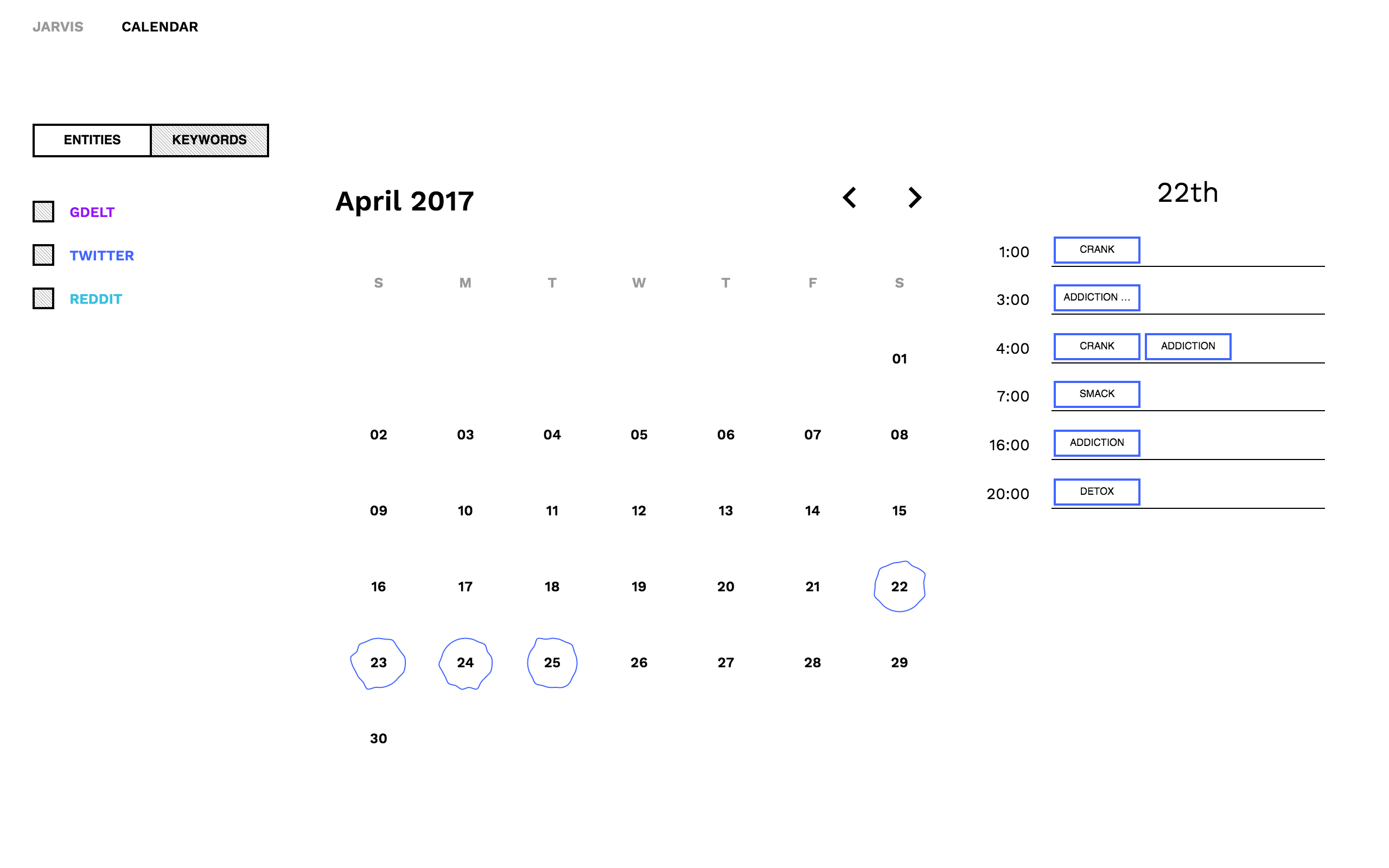
surprise me

Graphic representations of data

Graphic representation constitutes one of the basic sign-system conceived by the human mind for the purposes of storing, understanding, and communicating essential information.

—Jacques Bertin, Semiology of Graphics

Data visualisation is a field at the boundaries of math, programming and design, I like it. Visualisations are ubiquitous — they help people to understand by seeing curves, shapes, colours and patterns.

Here I collected some projects I worked on. I usually start with handmade drafts and iterate over ideas until I find convergence on a specific design.

Date

September 2015 and September 2016

Description

User interface for the monitoring of real time spatial data collected during the endurance trails Tor des Geants. Runners positions along the elevation profile are calculated from times registered at the checkpoints and the runner mean velocity.

Credits

Concept and front-end development by R. Scalco. Project realized in collaboration with P. Griselli.

Technology

Javascript, SVG, D3.js.

Iconic representations of data quality, each element describes the information completeness of the associated entity. Holes in the rings represent missing information in the entity's data structure, whereas the number of arcs visually communicate the complexity of underlying datum.
Detailed representation of information completeness in a pseudo-hierarchical data structure. Dashed lines show missing data, whereas solid lines without dots highlight absence of entities accepted as exceptions by business rules.
Read more at https://damneat.nextbit.it/.

Date

April - December 2017

Description

User interface for data quality analysis of rich datasets. Information completeness is visualized highlighting where data is missing.

Credits

Concept by R. Scalco. Created at Nextbit.

Technology

Javascript, Redux.js, Riot.js, Electron, SVG, D3.js.

Read more at https://qbert.nextbit.it/.

Date

April - September 2018

Description

Versatile user interface for anomalies discovery in operational business processes. With a focus on data visualization and collaborative functions, the highly interactive dashboard facilitates the visual exploration of process information and the discovery of process anomalies.

Credits

Concept by R. Scalco in collaboration with the team in Nextbit, front-end development by R. Scalco. Created at Nextbit.

Technology

Javascript, Vue.js, Vuex.js, SVG, D3.js.

Download the poster.

Date

January - March 2015

Description

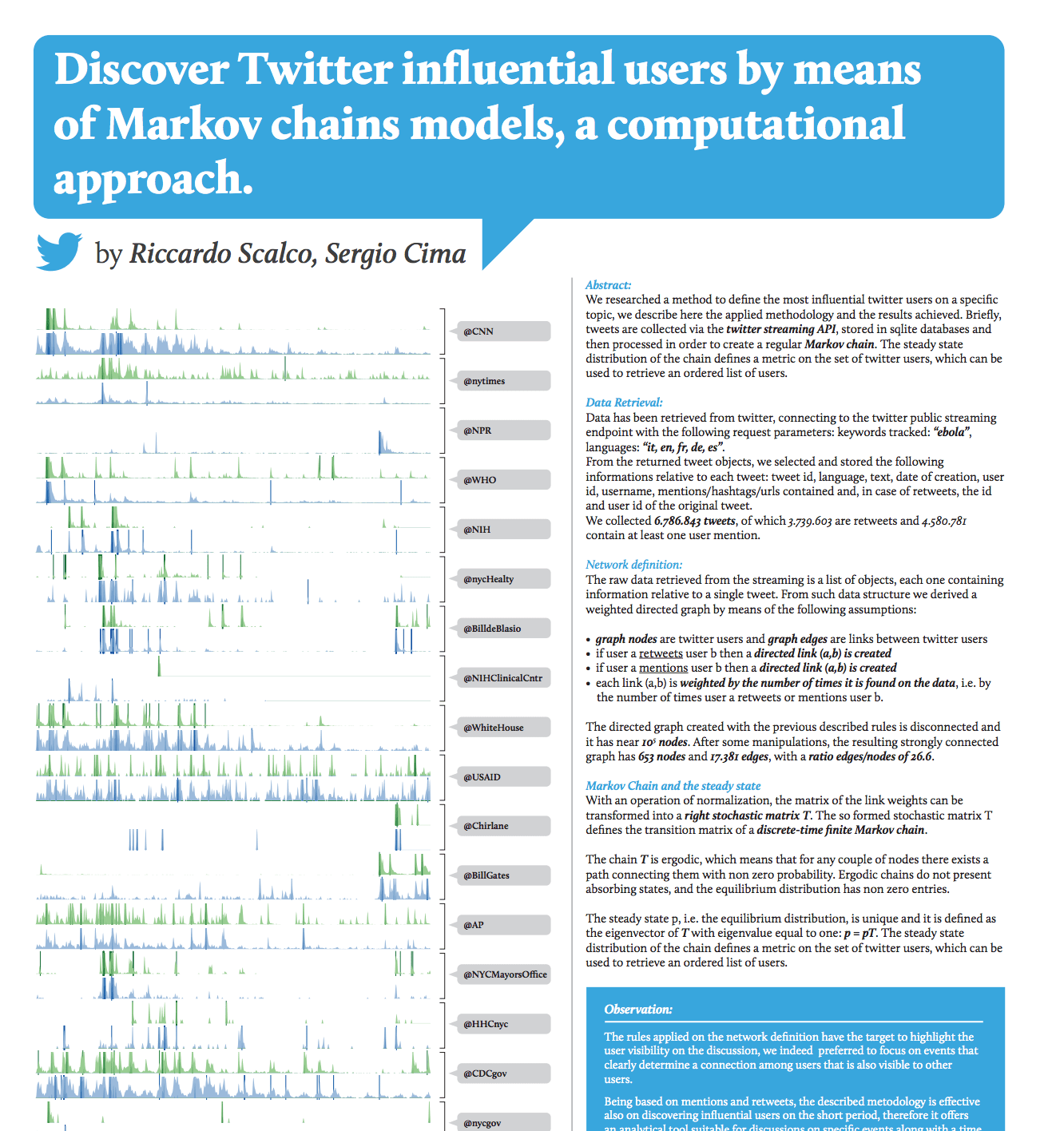
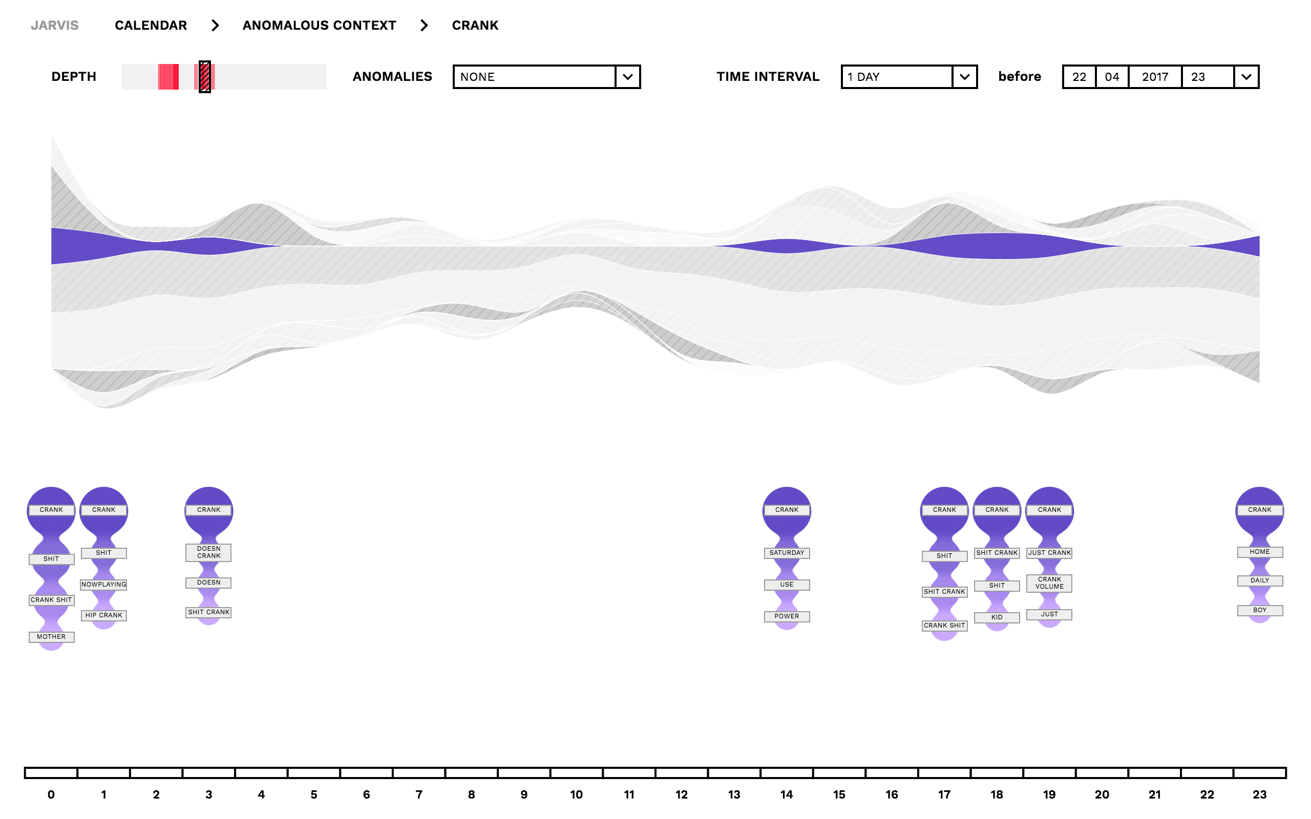
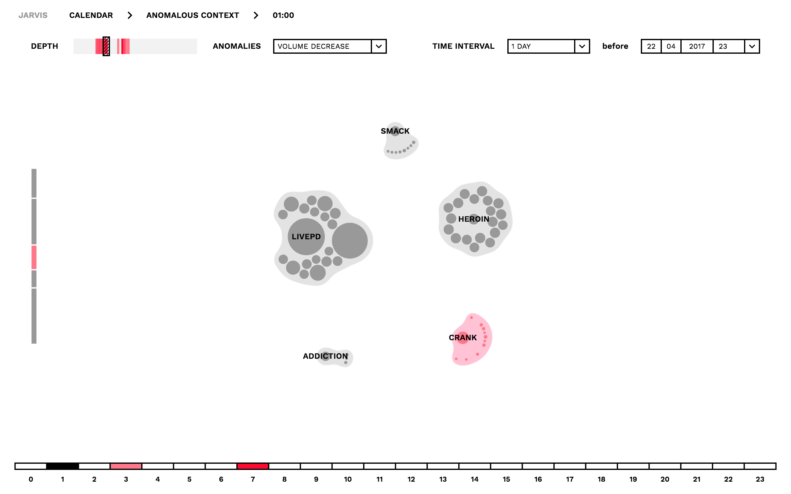
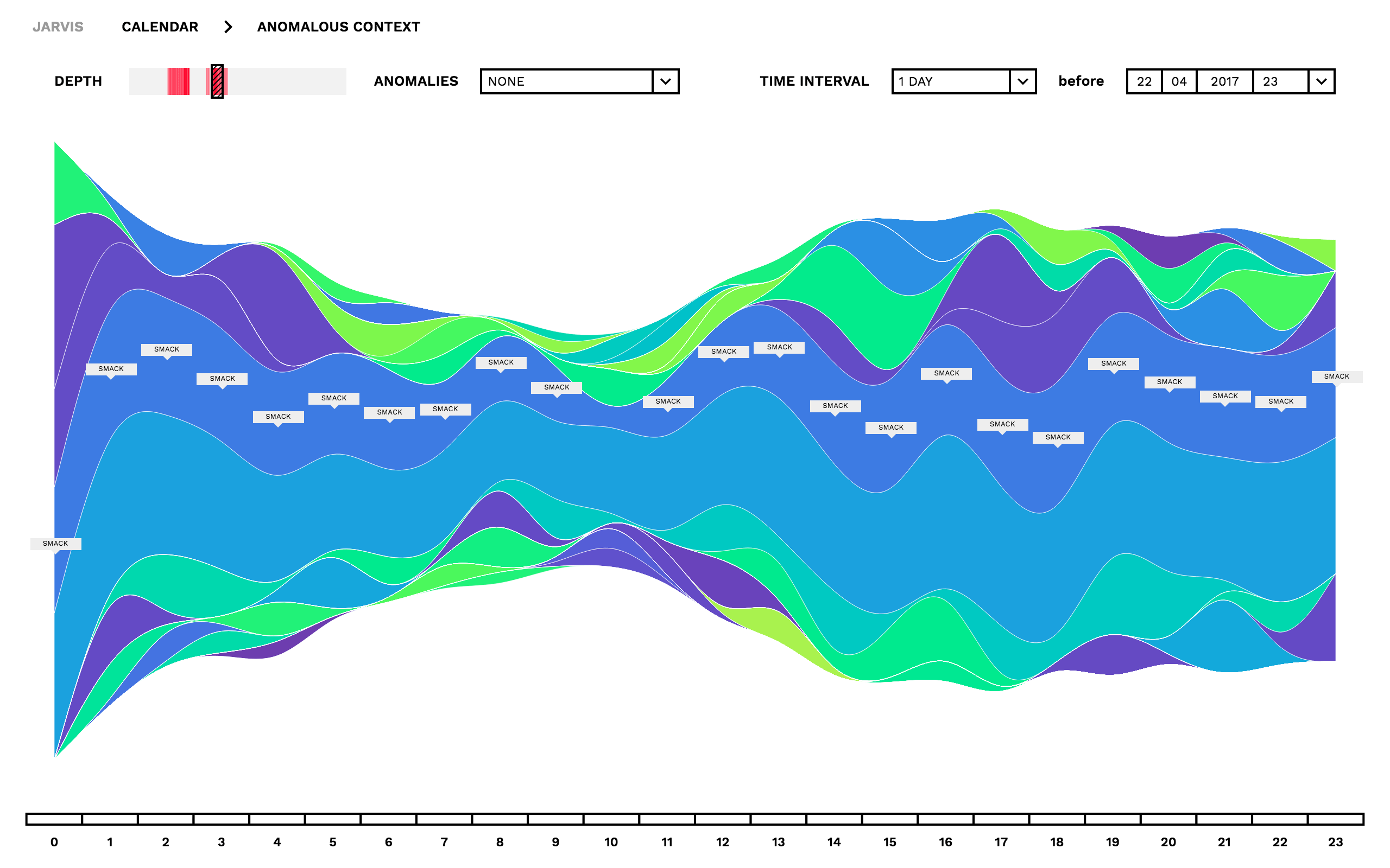
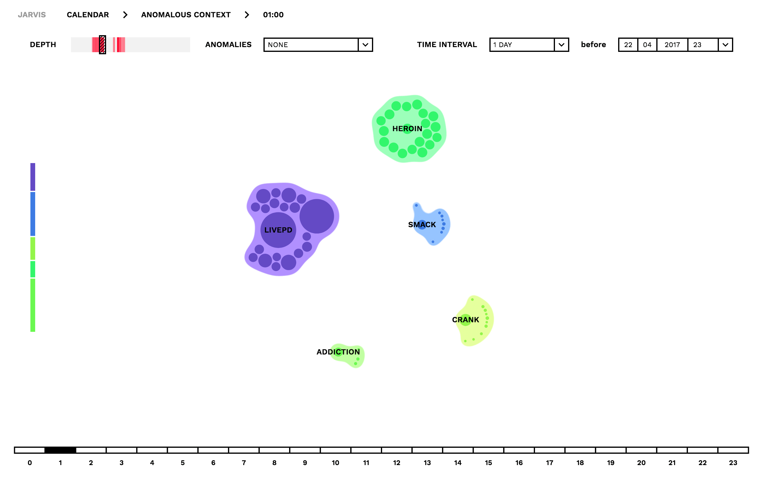
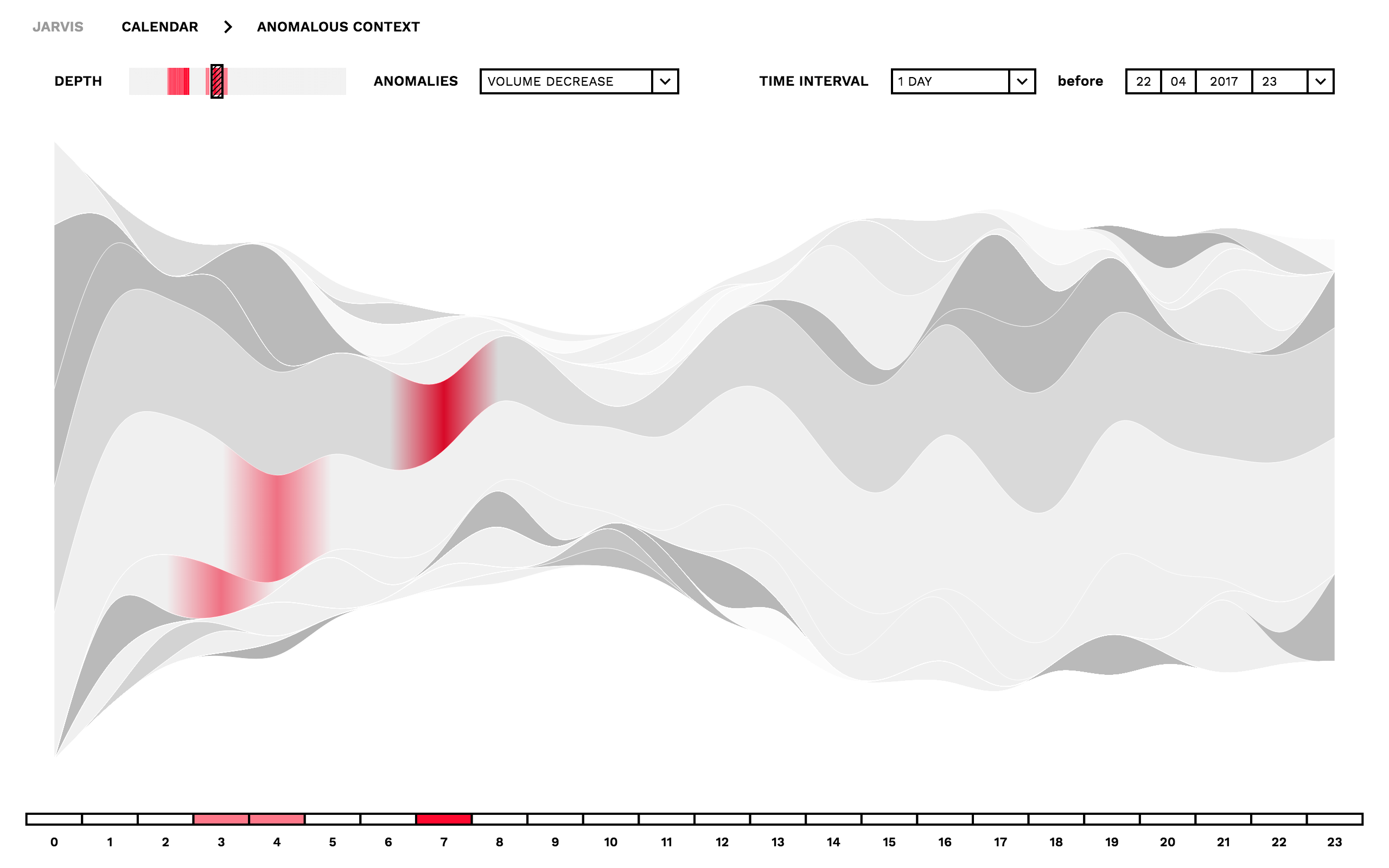
We researched a method to define the most influential twitter users on a specific topic. Briefly, tweets are processed in order to create a regular Markov chain. The steady state distribution of the chain defines a metric on the set of twitter users, which can be used to retrieve an ordered list of users. The rules applied on the network definition have the target to highlight the user visibility on the discussion, we indeed preferred to focus on events that clearly determine a connection among users that is also visible to other users. Being based on mentions and retweets, the methodology is effective also on discovering influential users on the short period, therefore it offers an analytical tool suitable for discussions on specific events along with a time variable list of influential users. The mathematical methods are based on the paper Equilibrium distribution from distributed computing, and we used Pykov for the manipulation of finite regular Markov chains.

Credits

The project has been requested by the editorial company Zadig and it falls under the tellme project. The project has been developed in collaboration with S. Cima (Tuxtax).

Technology

Python, Pykov, Javascript, SVG, D3.js.

Pictures from initial investigations.

Date

October - December 2015

Description

Prototype of a immersive user interface over a vast amount of textual information. The galaxy like spatial scattering of entities is based on a gaussian distribution on the y axis.

Credits

Concept by R. Scalco and P. Ciuccarelli, front-end development by R. Scalco. Created at CGnal.

Technology

Javascript, SVG, D3.js.

Read more at https://ridlock.nextbit.it/.

Date

November 2017 - March 2018

Description

The user interface is designed around the visualization of equivalence classes derived from the dataset, user interactions with the visual representation offer a way to filter and explore the underlying data.

Credits

Concept by R. Scalco in collaboration with the team in Nextbit, front-end development by R. Scalco. Created at Nextbit.

Technology

Javascript, Riot.js, Redux.js, SVG, D3.js.

Date

September 2017

Description

Development of a prototype graphical interface for the exploration of time dependent data and anomaly detection analysis.

Credits

Concept by Density Design, front-end development by R. Scalco and Density Design.

Technology

Javascript, Riot.js, Redux.js, SVG, D3.js.

Download the poster.

Date

April 2014

Description

Visual representation of Network Meta Analysis data inspired by atomic orbitals. Direct and indirect comparisons of clinical trials are visualized taking into account population size, variance and the derived probabilities. The proposal has been presented at The Mario Negri Institute for pharmacological research, in affiliation with the editorial company Zadig.

Credits

Graphical representation by R. Scalco and S. Cima (Tuxtax).

Technology

SVG.

Read more at https://www.viias.it/dataviz/.

Date

June 2015

Description

Custom data visualization of air pollution data collected in Italy, the visual representation provides a support for the presentation of the project Viias.

Credits

Concept and front-end development by R. Scalco. Project realized in collaboration with S. Cima and requested by the editorial company Zadig.

Technology

Javascript, SVG, D3.js.

Visible at https://riccardoscalco.github.io/populationDensityVsVoterTurnout/.

Date

December 2014

Description

This is one of my first data visualization projects. The voter turnout, i.e. the percentage of eligible voters who cast a ballot in an election, has been related with the population density of the 1206 municipalities in Piedmont. You can explore the analysis through an interactive visualization.

Credits

Concept and development by R. Scalco.

Technology

Javascript, SVG, D3.js.